Methods Used: Background Desk Research, Usability Review, Affinity Diagramming, Remote User Testing, In-Lab User Testing, Medium-Fidelity Prototyping, Interactive Prototyping
Tools Used: appear.in, Google Hangouts, Skype, Otter, Quicktime, User Testing Laboratory, Trello, Keynote, Axure
Key Themes: Accessibility, Information Architecture, Usability Testing, Research Planning
“I had to understand Parents Forward and their users to know what would serve their needs.”
Desk Research for Context
I had to understand Parents Forward and its users to know would what would serve their needs. So I started by reading about Parents Forward, Any Baby Can (which populates Parents Forward’s class content), and the organizations that offer the classes. Their primary users were parents court-ordered to take parent training classes and case workers serving those parents, so I read about these court orders next. I learned that the Travis County parents served by Parents Forward would typically be required to take parent training classes in response to a divorce or child abuse case. The contextual information I gathered from background research helped me empathize with my client and users, and guided my recruitment efforts for user testing.
Part of my usability review
Usability Review to Guide User Research
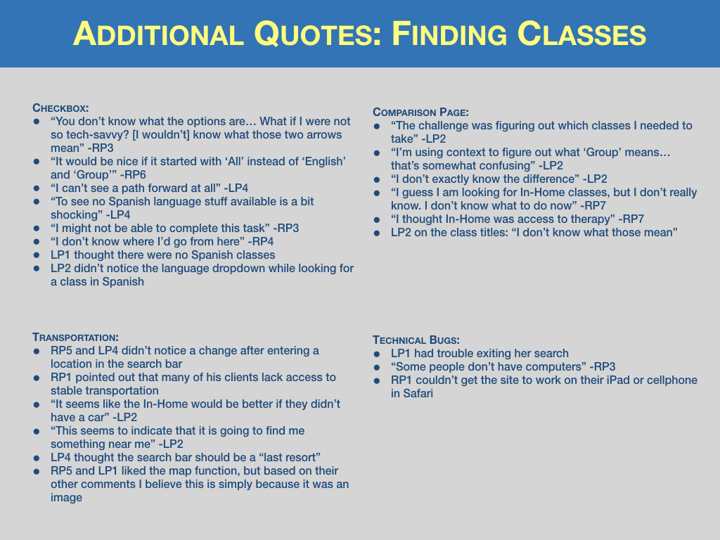
Guided by my user’s goals, I defined nine criteria to evaluate Parents Forward’s site. I identified 37 violations of these criteria and came up with corresponding recommendations to present to my research team in a usability review available here. Many of these recommendations called for further testing, so the usability review helped shape our script for user research. We wrote our findings on post-it notes for affinity diagramming and prepared for user testing
Applications used for remote user testing included appear.in, Google Hangouts, Skype, Otter and Quicktime
Remote User Testing
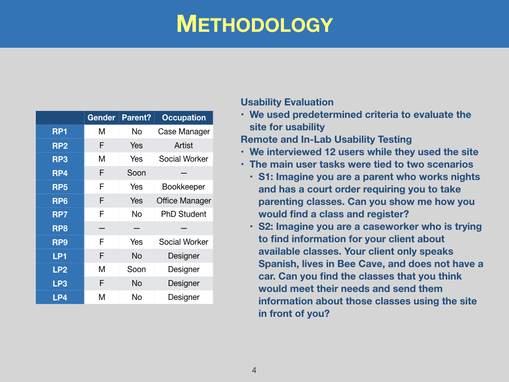
My research team and I individually conducted eight remote user tests of the Parents Forward site. My interview with a social worker who learned English as a second language (screen shot on the left) was especially helpful, as it gave me insights into what case workers would want from the site and how to make the site more accessible for Spanish speakers. Several final recommendations, including same-screen registration and photos of class instructors, were inspired by this interview.
“...it gave me insights into what case workers would want from the site and how to make it more accessible...”
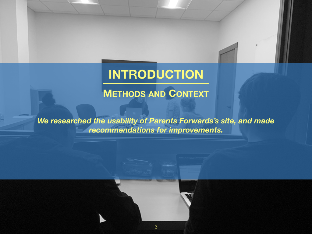
View from behind a one-way mirror at Fathom consulting
In-Lab User Testing
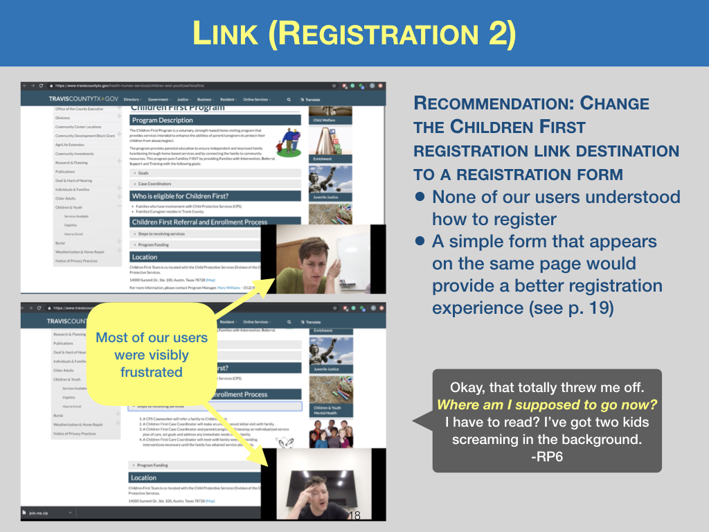
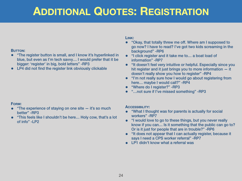
My research team conducted four usability tests in the lab, rotating roles each time so that everyone could moderate. Having four observers in person with the participants helped us focus on subtle emotional cues that might have been missed in remote testing. This level of detail was especially illuminating while parents discussed the stress of navigating a website in a busy household. We knew the registration process had to be quick and straightforward.
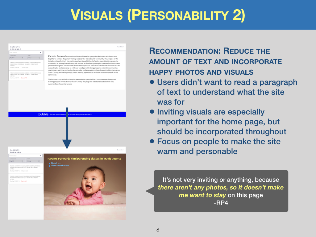
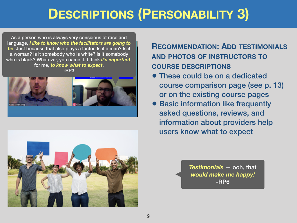
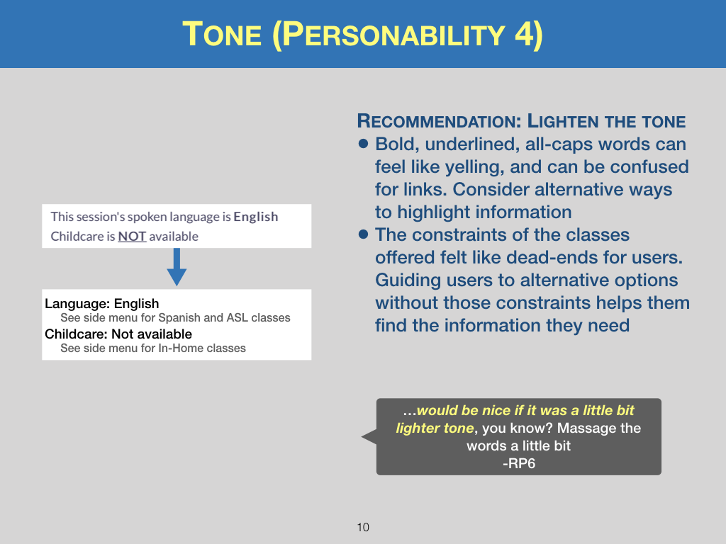
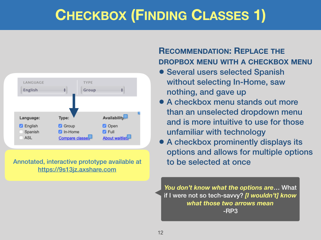
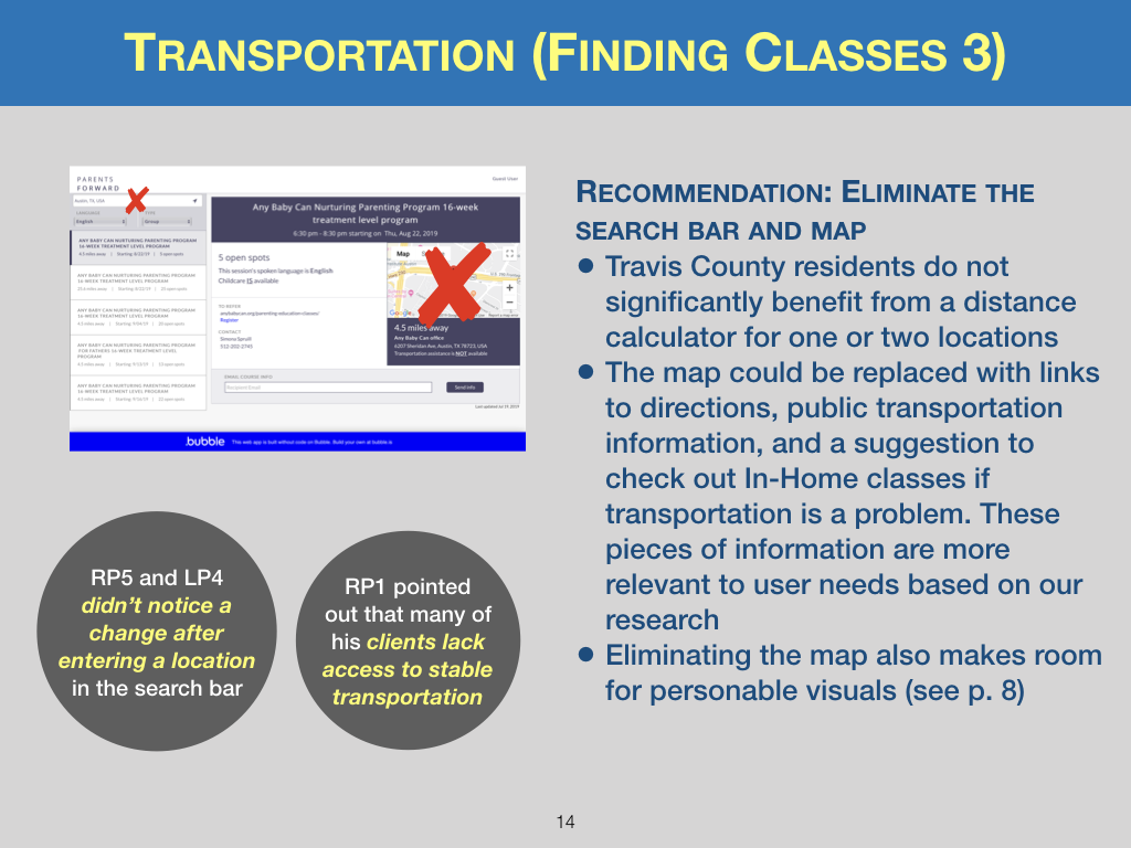
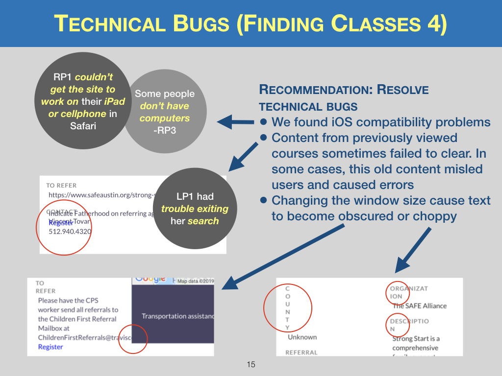
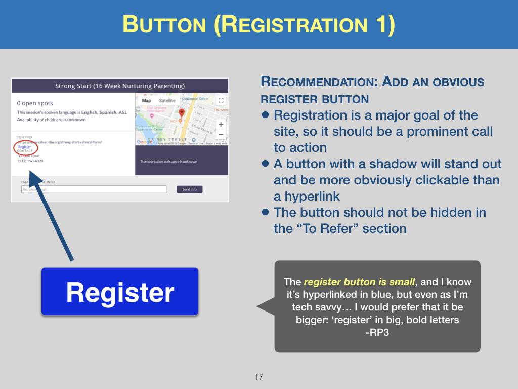
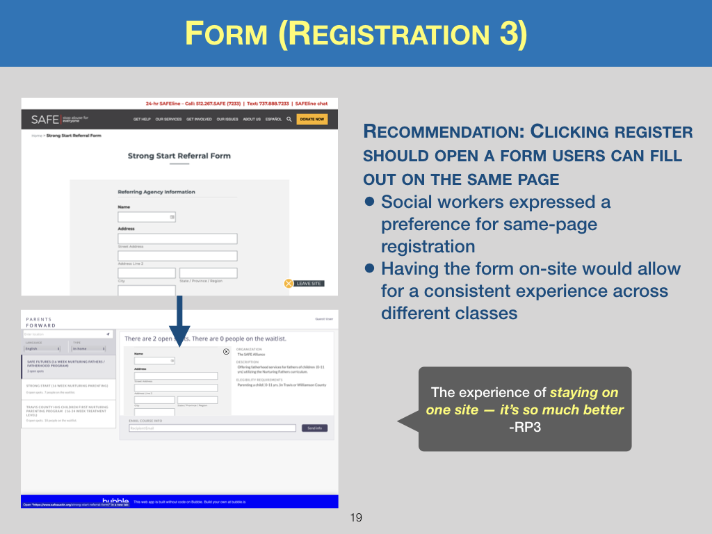
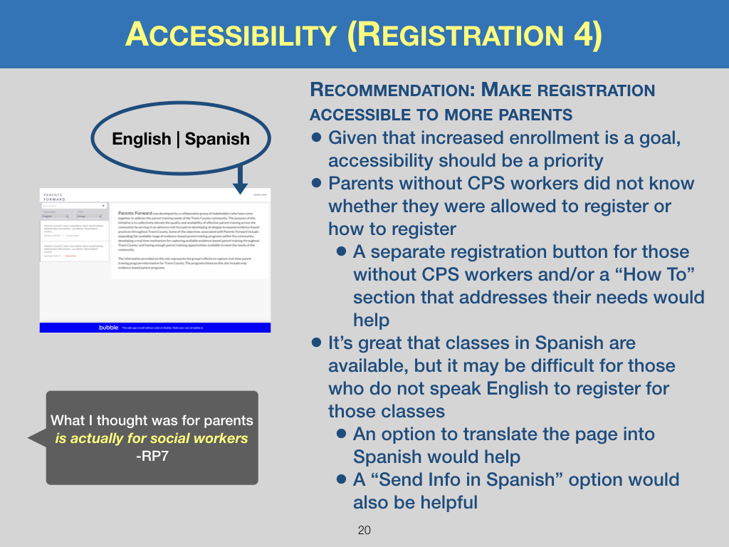
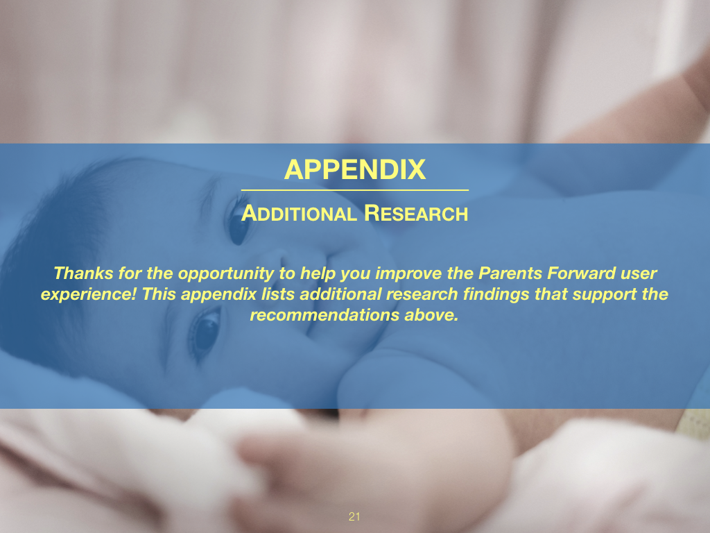
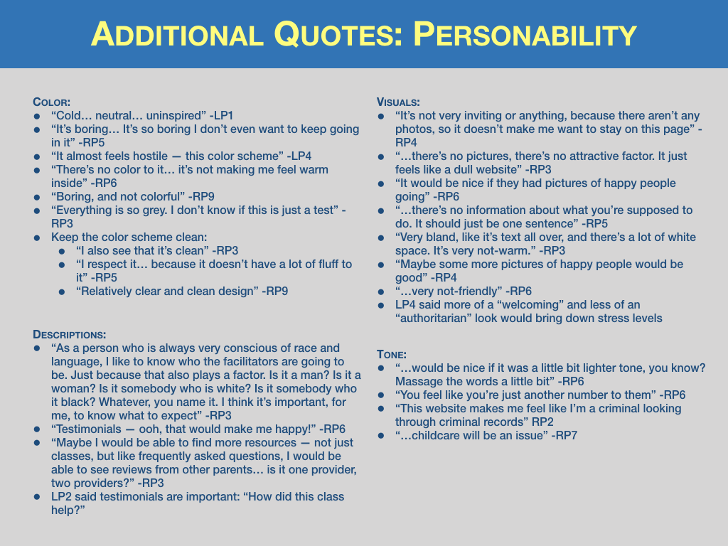
A page from my usability report. I show the recommendation, supporting points, a relevant quote from user research, the current page, and a prototype showing how the recommendation could be implemented on that page.
Synthesizing Findings and Pairing Them with Recommendations
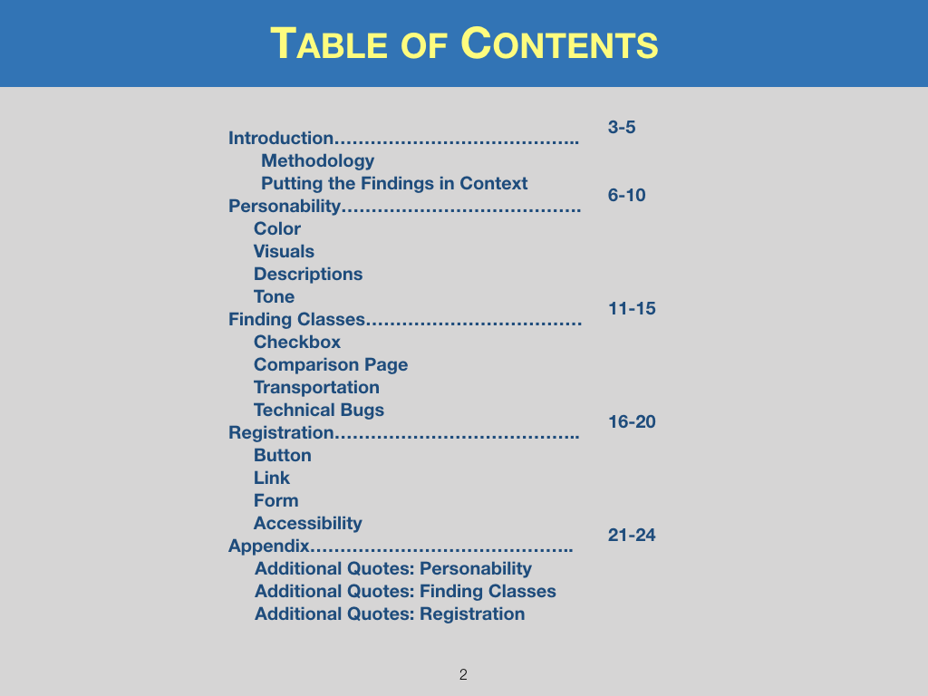
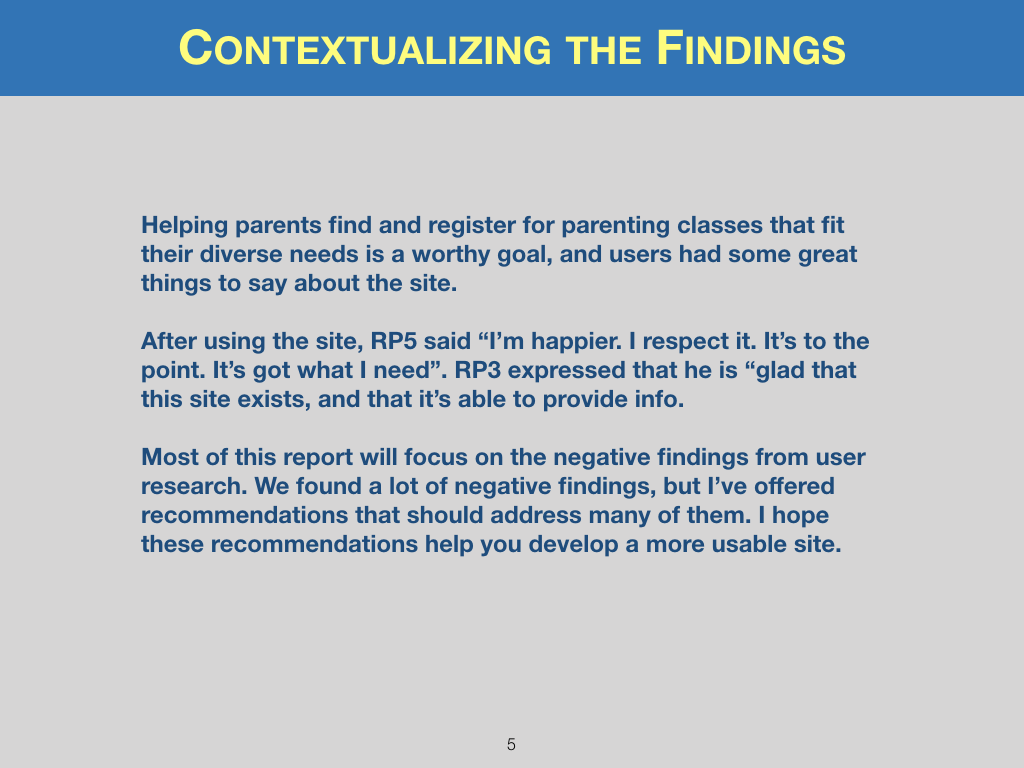
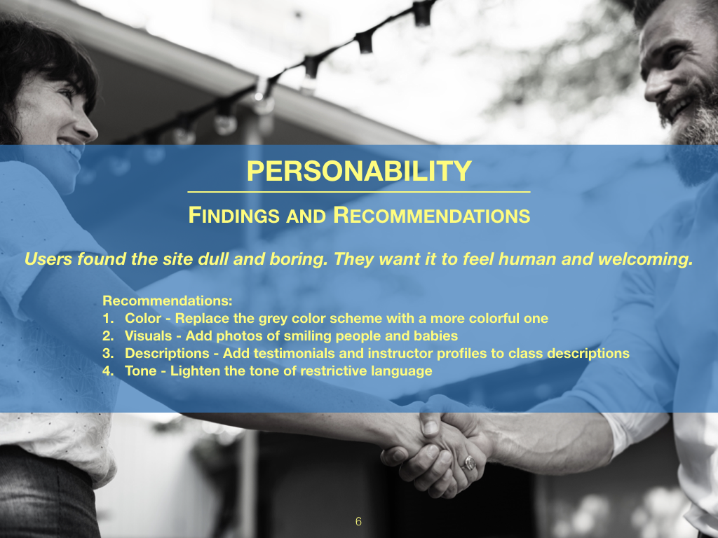
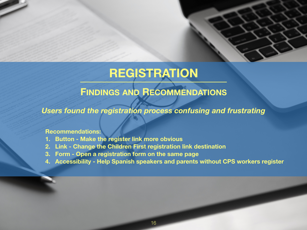
We collected our raw data on a shared Trello board and started affinity diagramming. After we synthesized the data, I prepared a usability report for the client. There were many high-priority recommendations, so I grouped them into themes like Personability and Registration and gave high-level overviews on title pages (scroll down to see the report).
Using Interactive Prototypes to Help the Client Understand
“My usability report explains why checkboxes eliminate the user errors we found, and my prototype allows my client see how.”
I demonstrated key recommendations with clickable prototypes. For example, I used Axure to create a prototype of my proposed checkbox menu. Using the prototype makes it clear why checkboxes are an improvement over the current dropdown menu, and annotations offer suggestions for different ways to implement them. My usability report explains why checkboxes eliminate the user errors we found, and my prototype helps my client see how.
